Redesigning Pulseheaven, a marketplace that outgrew its first design.
Pulseheaven is a fashion marketplace where people buy and sell clothes and connect with each other. As it grew, I redesigned the whole thing and rebuilt the WordPress setup underneath it. I did both the design and the development.
Founder, product strategist, UX/UI designer, WordPress developer, and performance engineer
Platform
WordPress, WooCommerce, marketplace and custom social functionality
Scope
A full redesign, plus ongoing custom features and speed work
Experience
Desktop and mobile, for buyers and sellers
01The challenge
It had outgrown its first design.
Pulseheaven kept adding features like selling, profiles, messaging, favorites, and AI try-on. Each one worked on its own, but together they didn't feel like one product anymore.
The visual system had drifted
As the platform expanded, pages picked up different styles, spacing, and components. The site looked less trustworthy than the product actually was.
Key actions competed for attention
Shopping, selling, and social actions sat side by side at similar weight, so new visitors had to figure out where to start.
Plugin screens felt like different sites
Marketplace, account, and social features came from different plugins, each with its own look and behavior.
Mobile journeys needed clearer hierarchy
Layouts designed desktop-first made important information harder to find on a phone.
More features meant more strain
Every new feature added weight, and eventually visitors feel that as a slow page or an error.
02Goals and constraints
Redesign everything, without breaking a live store.
What the redesign had to achieve
A recognizable, modern fashion-marketplace identity
Shopping and selling that are easy to understand
One consistent experience across marketplace, account, profile, messaging, and social pages
Better responsive behavior on every core page
What had to stay true
Live WordPress and WooCommerce functionality keeps working throughout
Real sellers, listings, and checkouts are never disrupted
Performance improves without removing important features
03Strategy and design direction
How I approached it.
A few simple rules guided most of the decisions.
Lead with what the site is
The homepage explains the marketplace first, then splits into clear paths for shoppers and sellers instead of presenting every action at once.
One component system
Shared cards, buttons, forms, and surfaces are applied across plugin-driven pages so marketplace, account, and social screens feel like one product.
Mobile-first hierarchy
Each core page was designed for a phone first, deciding what a visitor needs to see before they scroll, then expanded for desktop.
Let the clothes stand out
Soft colors, consistent spacing, and clean type, so the product photos get the attention.
Speed is part of the design
If a feature slowed the site down, it had to be worth it. I fixed heavy scripts and repeated database work during the redesign instead of leaving them for later.
04Before and after
Three before-and-afters.
Same screen size and the same content wherever possible, so the only thing that changed is the design.
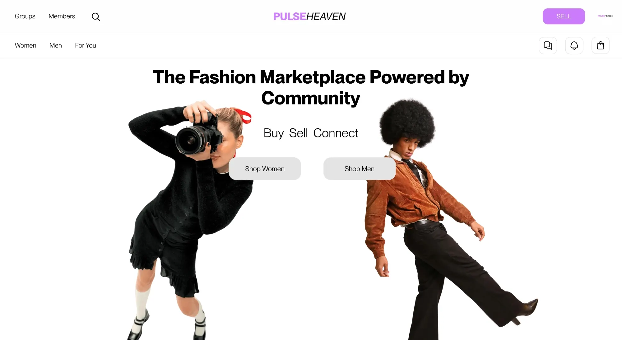
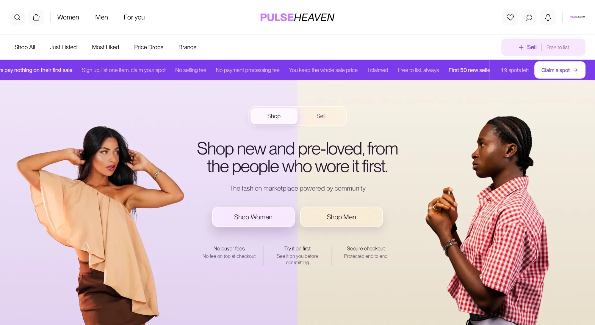
Problem: The old homepage had a slogan and two grey buttons, and it didn't really tell you what you could do there. Change: A headline that says what the marketplace is, a Shop/Sell switch, shopping shortcuts in the header, and a row covering buyer fees, try-on, and secure checkout. Why it matters: A new visitor knows what the site is, where to start, and why it's safe before they even scroll.
ProblemThe page didn't say what visitors could do there.
ChangeA clear headline, a Shop/Sell switch, and header shortcuts.
ReasonPeople decide in a few seconds whether a site is for them.
EffectVisitors get what it is, where to start, and why to trust it on one screen.
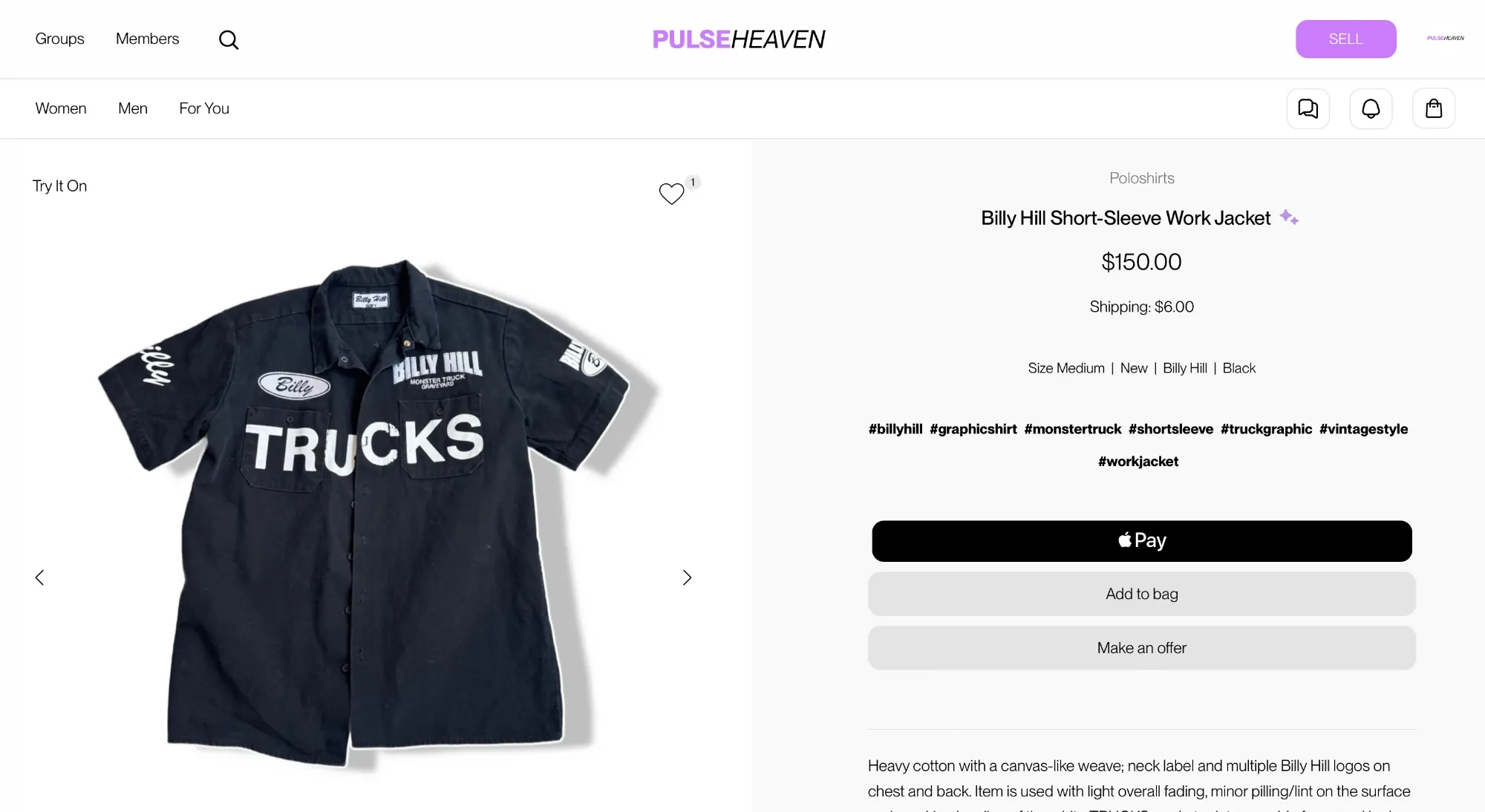
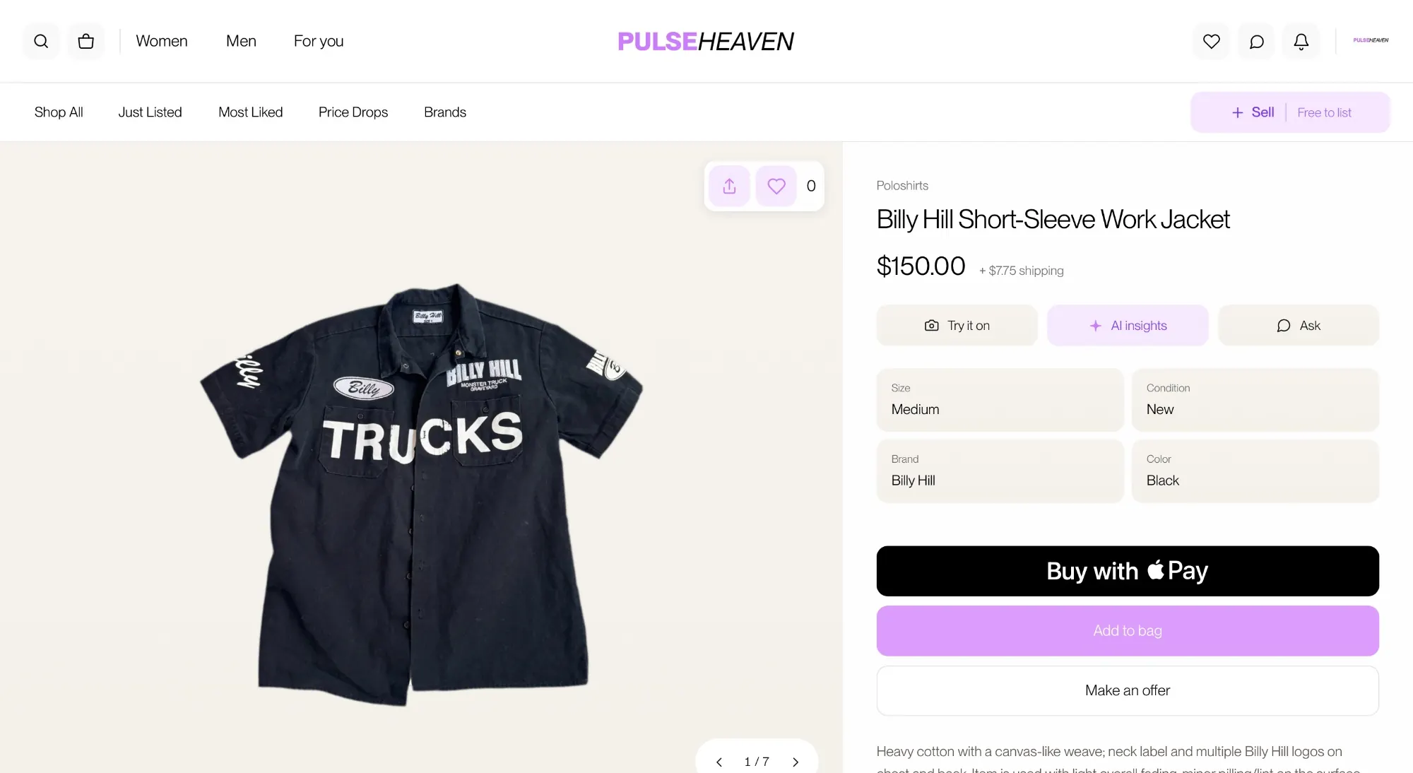
Problem: Everything was centered, there was a big block of hashtags, and the three buttons looked almost the same. AI try-on was easy to miss as a small text link. Change: The details are left-aligned, with size, condition, brand, and color in labeled cards. Try it on, AI insights, and Ask are real buttons, and the buy options go from Apple Pay to Add to bag to Make an offer. Why it matters: Shoppers see what they need to decide quickly, and the next step is obvious.
ProblemThe important stuff and the extras all looked the same.
ChangeLabeled detail cards and a clear order for the buy buttons.
ReasonThis page is where browsing turns into buying.
EffectEverything needed to decide is easy to see.
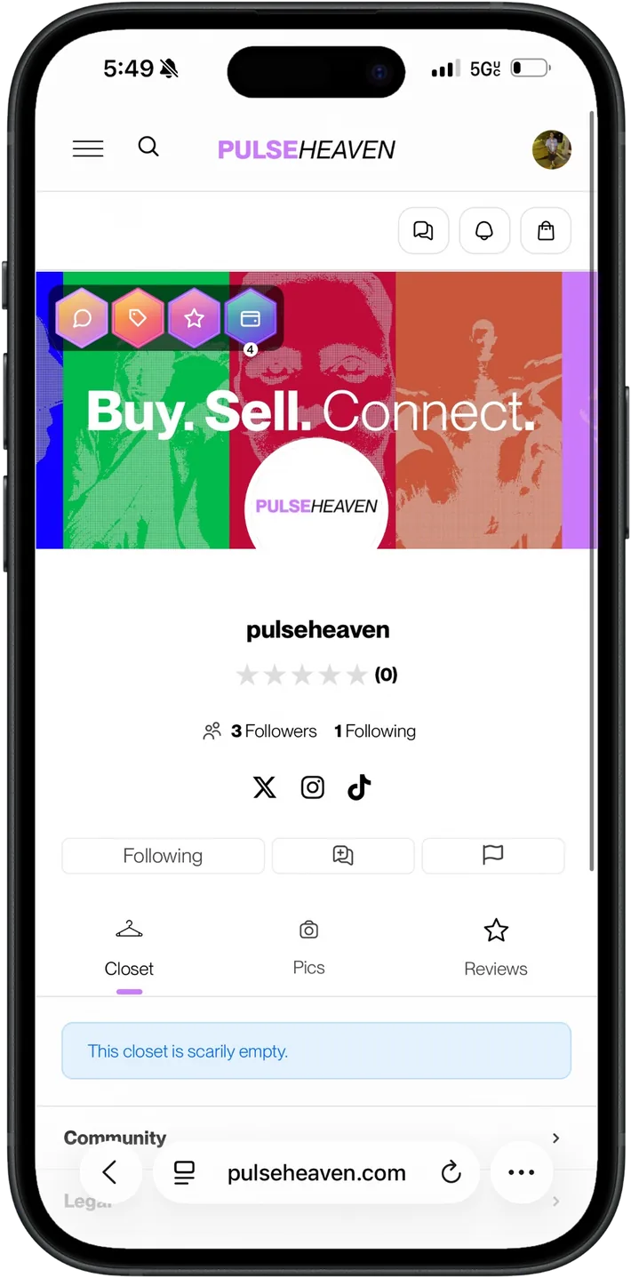
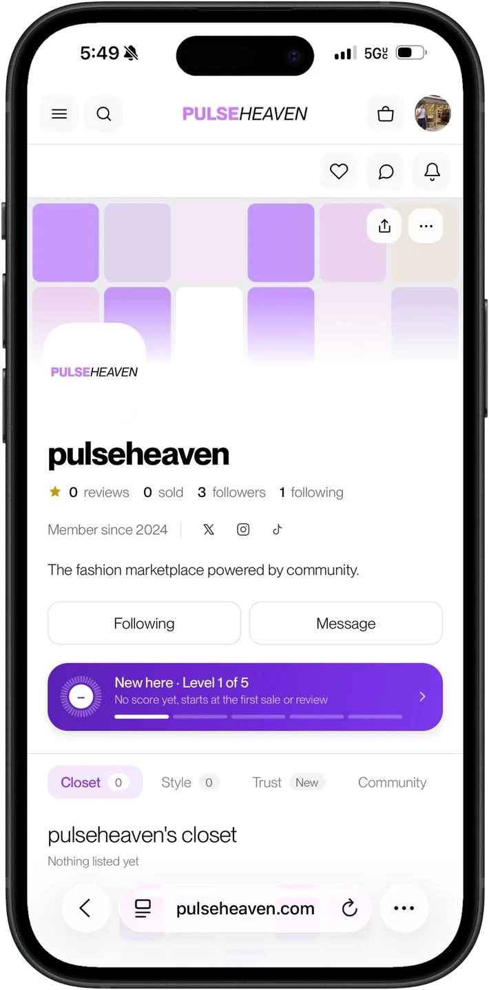
Story 3 · Seller profile on mobile
A seller profile that builds trust on a phone.
Before
Profile · mobile · beforeprofile-mobile-before.webp
After
Profile · mobile · afterprofile-mobile-after.webp
Problem: A loud banner with badges on top of it pulled attention away from the seller, and things like reviews were easy to miss. Change: A calmer banner, the seller's name up top, stats on one line, clear Follow and Message buttons, and a card showing the seller's level. Why it matters: Buyers can size up a seller quickly before they shop their closet.
ProblemThe banner and badges drowned out the seller.
ChangeName first, stats on one line, and a trust card.
ReasonBuyers decide whether to trust a seller from this page.
EffectSellers look legit, and buyers know who they're buying from.
05Under the hood
The work behind the scenes.
A site also has to take payments, pay sellers the right amount, and stay fast when it's busy. Here's what that took. Open Technical details if you want the specifics.
Checkout
Fixed an Apple Pay checkout failure
Some customers couldn't complete checkout with Apple Pay. I tracked down the cause and fixed it, so Apple Pay just works now.
Technical details
The failure came from a nonce mismatch buried in the payment flow's JavaScript. The fix corrected how the nonce was issued and passed through the checkout sequence.
Marketplace payouts
Rebuilt the shipping and payout plugin
Seller earnings have to be right every time. I rewrote the custom shipping plugin so commissions and payouts are calculated correctly and orders aren't processed twice.
Technical details
The rewrite fixed commission errors, vendor earnings that were being deducted twice, and duplicate webhook processing.
Performance
Found and fixed a server bottleneck
When traffic picked up, the server was running out of room. I found the two requests causing it, cached them, and rebalanced the server so the site stays quick.
Technical details
PHP worker exhaustion was traced to two slow, uncached REST endpoints. I added caching for both, rebalanced the PHP worker pools, and run a persistent object cache to cut repeated database work.
Cost control
Cut unnecessary tax API calls
The tax setup was recalculating way more often than it needed to. I rebuilt it to only calculate when it matters, and the tax reporting stays accurate.
Technical details
The Stripe Tax integration recalculated on every cart update. The rebuild removed redundant recalculation while keeping accurate nexus reporting intact.
AI feature
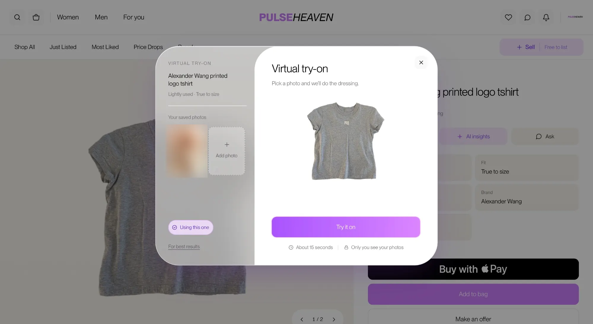
AI virtual try-on
Shoppers can see how an item might look on them before they buy. It's built right into the product page.
Social layer
Profiles, messaging, and favorites
Buyers and sellers can follow each other, send messages, and save favorites, so it feels more like a community than a catalog. It all matches the rest of the site.
06The finished experience
More from the redesign.
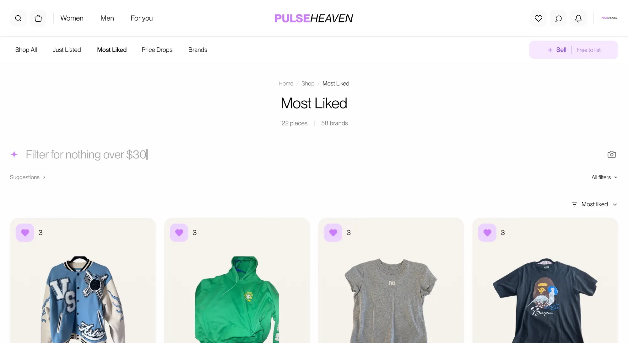
Shop / discovery · desktopshop-desktop-after.webp
Shop and discovery. Curated collections like Most Liked and Price Drops, plus an AI filter bar that understands requests like “nothing over $30.”
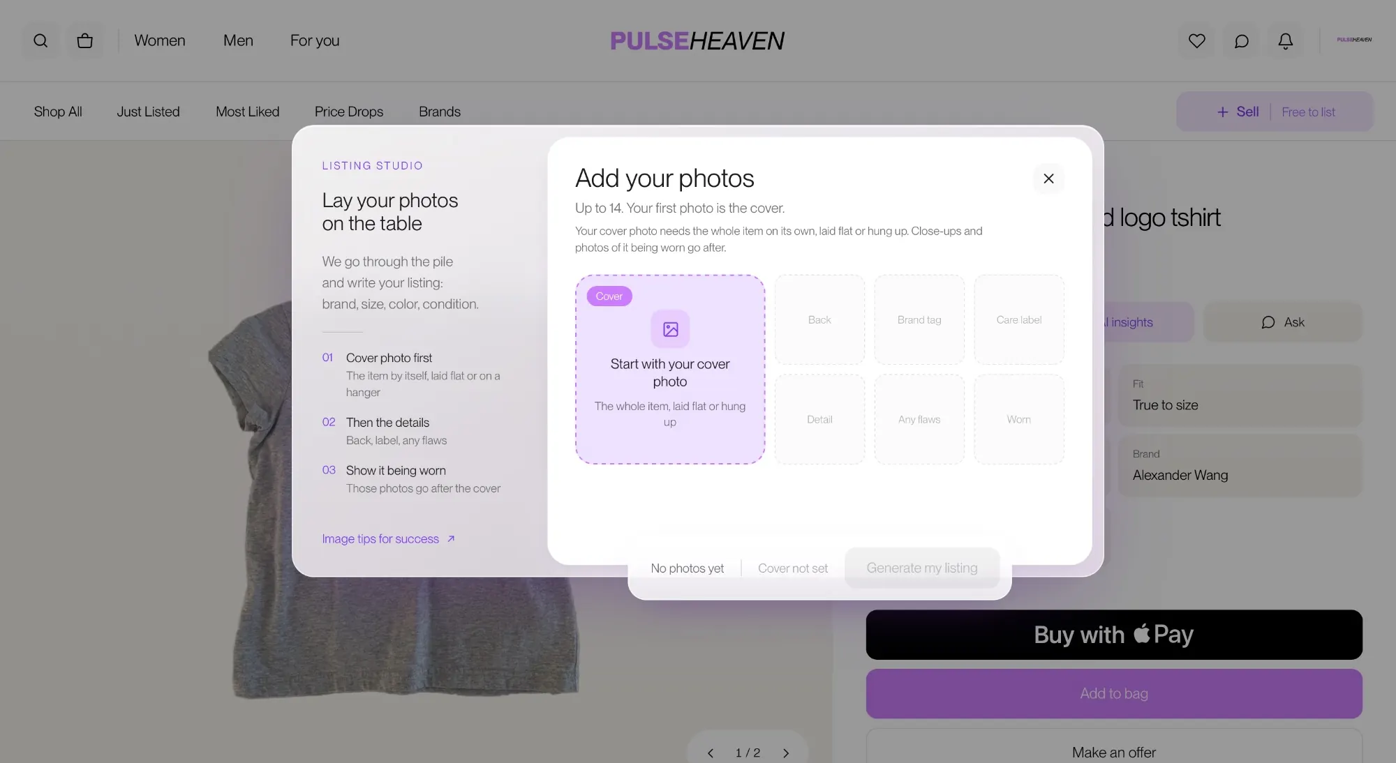
Listing Studio. Sellers add a cover photo and detail shots, and the listing (brand, size, color, condition) is written for them.
AI try-on · desktoptryon-desktop-after.webp
AI virtual try-on. Shoppers pick a saved photo and see the item on themselves in about 15 seconds. Only they can see their photos.
Price Drops · mobile
Messaging · mobile
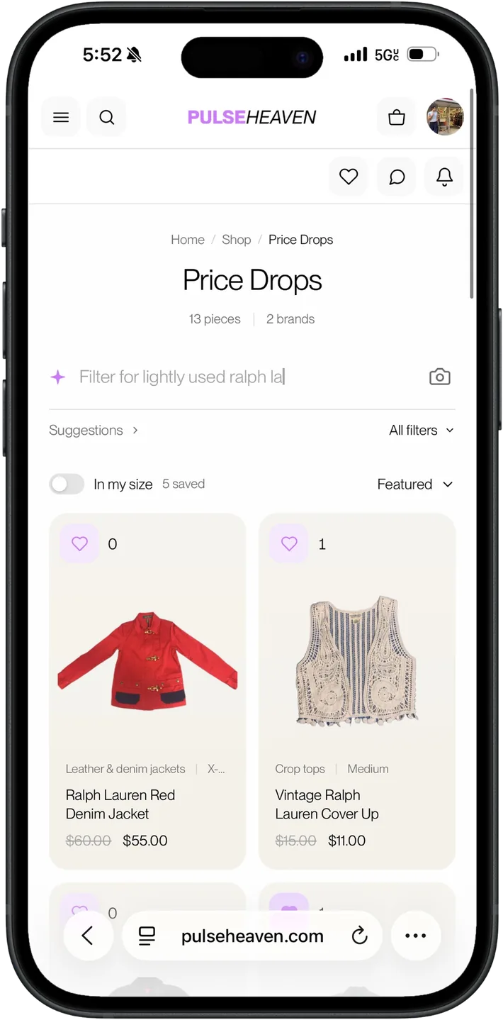
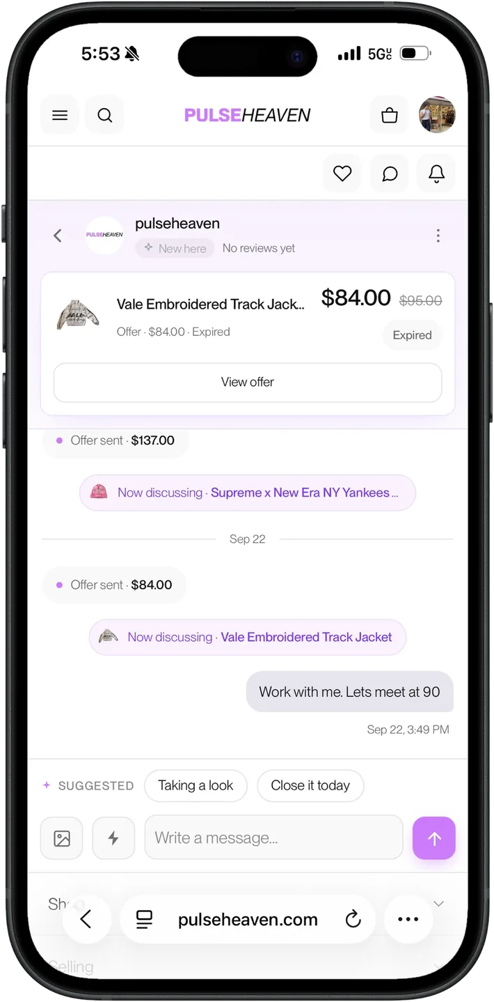
Built for phones. Shopping with an In my size toggle, and messaging where offers and the item under discussion sit right in the conversation.
07Results
What changed.
One consistent look across the shop, product, profile, account, and messaging pages
Pages that work well on phones for both buyers and sellers
An Apple Pay checkout that works, and seller payouts that add up
A faster, steadier server with cached requests and fewer wasted API calls
Custom marketplace, social, and AI features, all running on WordPress and WooCommerce
Pulseheaven is still growing, so I'm not claiming a jump in sales or sign-ups here. What I can point to is a site that looks consistent on every page, works well on phones, and runs on a faster, more stable setup.
08Reflection
What I learned.
The hardest tradeoff
Plugins make it quick to add features, but each one comes with its own look and slows things down a little. The hardest calls were deciding when to restyle a plugin, when to rebuild a piece of it, and when a feature wasn't worth what it cost in speed.
What I took from it
Design problems and technical problems usually show up together. A confusing page and a slow page both make people leave, and fixing one usually means touching the other.
What I'd test next
Now that the new version is live, I want to watch how real shoppers use the product and listing pages and see where they still get stuck.
You may not need a marketplace this complex.
But if your website looks outdated, feels difficult on mobile, or needs more than a template can do, I can help.